)

Crafting a strong CV is about more than just listing your qualifications and experience. It’s also about presenting the information in a way that is professional, readable, and visually appealing. One often-overlooked element of CV design is your font choice. The right font not only helps your CV get past applicant tracking systems (ATS) but also creates a lasting impression on hiring managers.
Whether you’re working in creative industries or pursuing a more traditional role, this guide will help you select fonts for your CV that are simple and easy to read, ATS-compatible, and suitable for your job search. We'll also provide practical advice on font sizes, formatting tips, and how to choose the right font to help you design an impressive CV.
Why font choice matters in your CV
Font choice plays a major role in how recruiters perceive your CV. A clear, professional font ensures your CV is easy to read, both in print and on-screen. It can also influence ATS compatibility, as some default fonts are more likely to be recognised and processed by these systems. With studies showing that recruiters spend just 6–7 seconds scanning a CV, readability is key. A fun font can showcase your creative flair, but if a hiring manager can't read your CV, you've missed out on your next new job opportunity.
Selecting an unprofessional font, such as Comic Sans, or using a small font size, can detract from your content. Combining a professional layout, with ATS-friendly and industry-appropriate fonts increases your chances of being noticed by hiring managers and advancing in the screening process.
What are the top 10 fonts on a CV?
The best fonts for your CV strike the perfect balance between professionalism and readability. The most common fonts include Calibri, Cambria, and Arial, which are widely known for their versatility across different industries and roles, making them more suitable options for your CV. The right font can elevate your job search and make your CV design more appealing to recruiters.
Top 10 CV fonts
Best CV font tips
Keep it professional
Choose clear, sans-serif fonts like Arial or Helvetica which are widely recognised.
Prioritise readability
Ensure is easy to read for recruiters as well as compatible with ATS systems.
Maintain consistent formatting
Stick to one font style and opt for a font size between 10 and 12 points.
What are the main types of CV fonts?
There are two most well-known types of fonts on a CV: serif and sans-serif. Serif fonts, known as serifs, have tiny strokes at the end of each character, giving them a more traditional and formal appearance. On the other hand, sans-serif fonts lack these strokes, offering a cleaner and modern look often preferred for online content and CVs.
CV typography
1. Serif
Classic, elegant, conveys professionalism.
Enhances readability in printed materials.
Suitable for traditional or experienced professionals.
2. Sans serif
Modern, clean, easy to read on screens.
Conveys a contemporary, approachable image.
Ideal for tech fields or roles requiring modern aesthetics.
3. Monospaced
Mimics handwriting, adds creativity.
Best for headings, artistic professions.
Personalises CV, showcases design skills.
4. Script
Equal character space aids clarity.
Perfect for coding, technical documents.
Gives a structured, organised, technical look.
5. Display
Highly decorative, eye-catching design.
Ideal for creative industries, unique headers.
Makes bold statements, eye-catching.
While other font types such as monospaced, script, and display exist, some recruiters may consider them less readable or unprofessional, so we advise excluding them from your CV. Knowing which category suits your industry and job role can help you choose the best font and improve your chances of landing that all-important job interview. Below, we break down some popular serif and sans serif fonts that work well in various industries:
Serif fonts
Serif fonts have small strokes at the ends of each letter, giving them a classic and formal look. These fonts are great for traditional industries such as law, finance, or education:
Georgia
Garamond
Times New Roman
Cambria
Sans Serif fonts
Sans serif fonts lack the decorative strokes of serif fonts, offering a clean, modern appearance. These are ideal for creative industries and roles where simplicity is key. Some reliable choices include:
Arial
Helvetica
Calibri
Verdana
Sans serif fonts are generally more screen-friendly, especially for ATS processing and digital applications.
Fonts to avoid
Certain fonts, while eye-catching, lack professionalism. Fonts like Comic Sans, Papyrus, or overly decorative scripts should be avoided, as they can make your CV appear informal or unpolished.
Practical examples for formatting your CV
Example 1: Clean and professional (traditional roles)
For roles in law, finance, or administration:
Font choice: Times New Roman or Cambria
Font size: 12 points (body), 14 points (headings)
Layout: Simple Microsoft Word resume template with clearly defined sections.
Finance CV example
 Download this finance CV example in PDF.
This finance CV example features a Finance Manager who uses Source Sans Pro and a grey font to complement the grey CV template colour to effectively showcase their experience and expertise.
Example 2: Modern and minimalist (creative industries)
For design or marketing roles:
Font choice: Calibri or Helvetica
Font size: 11 points (body), 16 points (headings)
Layout: Use resume templates with bold headings and subtle design elements.
Designer CV example
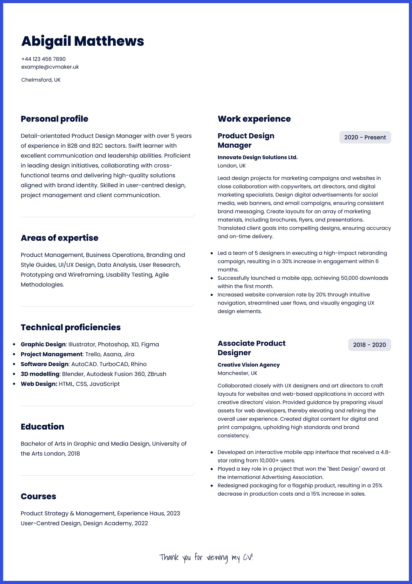 Download this Designer CV example in PDF
This Designer CV example features a seasoned Product Design Manager who uses DM Sans and a slightly grey font to complement the colourful CV template colour.
What is a good font and size for a CV?
The three pillars of a good CV font are simplicity, readability, and compatibility with ATS. The ideal font size ensures your CV remains visually striking and easy to read:
Body text: 10-12 points
Headings: 14-16 points
Subheadings: 12-14 points
Clean headings, subheadings, and body text formatting are key to a polished CV. Maintain a consistent font size and style to present a professional document. Use the recommended fonts below:
Simple: Arial, Calibri, Helvetica
Reader-friendly: Georgia, Cambria, Garamond
ATS-friendly: Times New Roman, Verdana, Courier New
For more tips, refer to our blog article about the best colour for your CV.
Fonts and ATS compatibility
Your font choice isn’t just about aesthetics; it also needs to be compatible with applicant tracking systems. ATS software scans CVs for keywords and content using pre-defined formatting rules. Fonts like Times New Roman, Arial, and Calibri are default fonts for many ATS platforms, making them safe options for your CV.
Tips for ATS-friendly formatting
Stick to one font throughout your CV for consistency.
Avoid using uncommon or overly decorative fonts that ATS software may struggle to read.
Opt for simple resume templates that prioritise a clean design.
Key takeaways
Creating a successful CV goes beyond selecting a vibrant font or an eye-catching template. It’s about cultivating a consistent, professional look that resonates with your job target. By integrating our industry tips and future-proof fonts, you can confidently apply for your dream job. Your next opportunity awaits just around the corner, so ensure you opt for the appropriate font to help you break through the competitive UK job market. Your well-designed CV might be the game-changer you need to secure that job.
Next steps?
Once you know your desired design and font, the next step is to create a simple yet ATS-friendly CV. Explore our services below for more professional support:
CV Builder: See 20 professional CV templates to help create a tailored and professional CV.
Cover Letter Builder: apply with a matching cover letter template with a clear layout so you can easily personalise and adjust to your career goals.
CV Writing service: connect with one of our experts to receive feedback and get quick, professional advice on tailoring your CV to a specific job.
Blog: see our guides and brief articles to educate yourself on the best strategies to improve your job prospects.
Dedicating time to making a master CV can help you significantly improve your job prospects.

FAQs
Is Sans serif or Serif more professional?
Serif fonts are considered classic and formal, while sans-serif fonts are seen as minimalist and casual. Print publications like books and newspapers often use serif fonts, while digital journals or magazines favour sans-serif fonts. Remember, your font choice should align with the industry you're applying to.
What font size should a CV be?
We recommend a font size between 10 and 12 points. It ensures readability while allowing you to present your information effectively.
What fonts are safe for a CV?
Fonts like Calibri, Arial, and Times New Roman are safe choices due to their readability and widespread acceptance by recruiters and hiring managers within the UK and across the globe.
ATS-friendly CV font
Use plain fonts like Arial or Calibri. To be on a safe side, avoid italics or underlines. Ensure simple formatting and style (e.g. spelling out acronyms and no personal pronouns).
Is 10 font too small for a CV?
A font size of 10 may be too small for some readers. Instead, opting for 11 or 12 points would be safer, as it ensures clarity and readability for a wider audience. However, keep in mind all three sizes are widely accepted regardless of readability.
Is it okay to use different fonts on a CV?
It's best to stick to one consistent font throughout your CV. Using different fonts can make it confusing for recruiters. Instead, emphasise essential details with bold or larger text for headings and job titles, and use italics for company names. This approach can help you maintain a clean and professional look.
Which font should you not use in your CV?
Your CV is your passport, so your font choice should also be professional. Stay away from fonts like Comic Sans, Papyrus, and, of course, Wingdings.
Should you use the same font for your cover letter?
It’s a good idea to match your CV and cover letter fonts. Consistency between these two documents helps establish a cohesive, professional appearance. Choose a default font like Calibri or Arial that works well across both documents, keeping them aligned with ATS requirements.